Check List
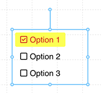
A series of checkboxes that a user can select and de-select one or more options. The Check List can respond to click events to perform actions within the interface, or to modify tags on the server.
Properties
| Property | Type | Description |
|---|---|---|
| Options | Content | Sets the available entries and tag assignments |
| Font | Font | Font style used for the option entries |
| FG Color | Color | Foreground text color |
| BG Color | Color | Background or fill color behind the check list |
| Selected Color | Color | Foreground text color for a selected check list item |
| Selected BG Color | Color | Background text color for a selected check list item |
| Border | Border | Optional border around the Component |
| Enabled | Boolan | Enables or disables the item - only used to control when the Change event is active |
| Visibility | Boolean | Determines when to show or hide the Component |
| Change | Event | Handles a click event on an item |